BoTree
On the spice route with the world’s finest pepper
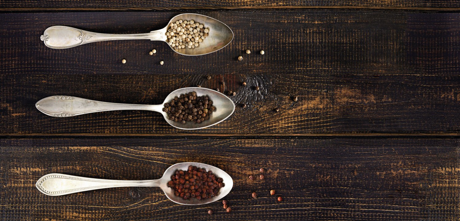
Kampot pepper is the only pepper in the world with a Protected Geographic Indication (PGI). It is the Champagne of pepper.
A packaging redesign and logo refresh gave BoTree the tools to sell its single origin seasonings to consumers, prestige retailers and chefs—and support its pepper-growing community in Kampot, Cambodia.
Updating the logo
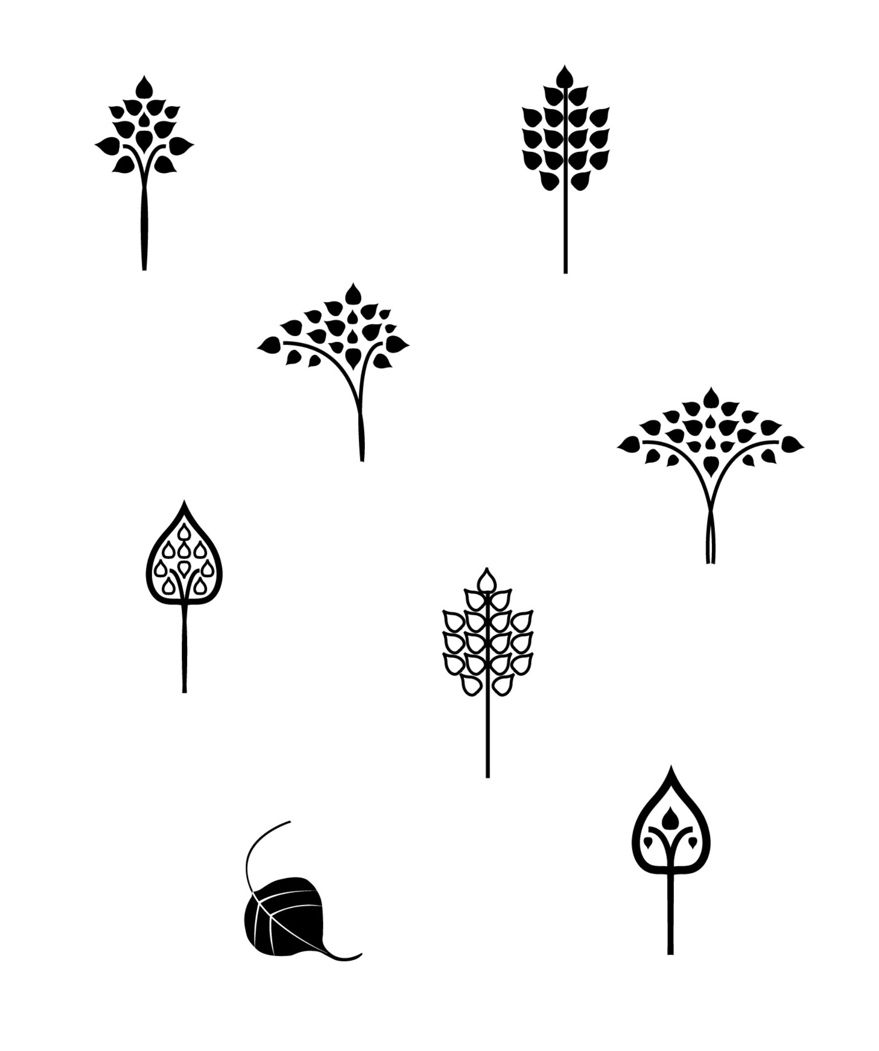
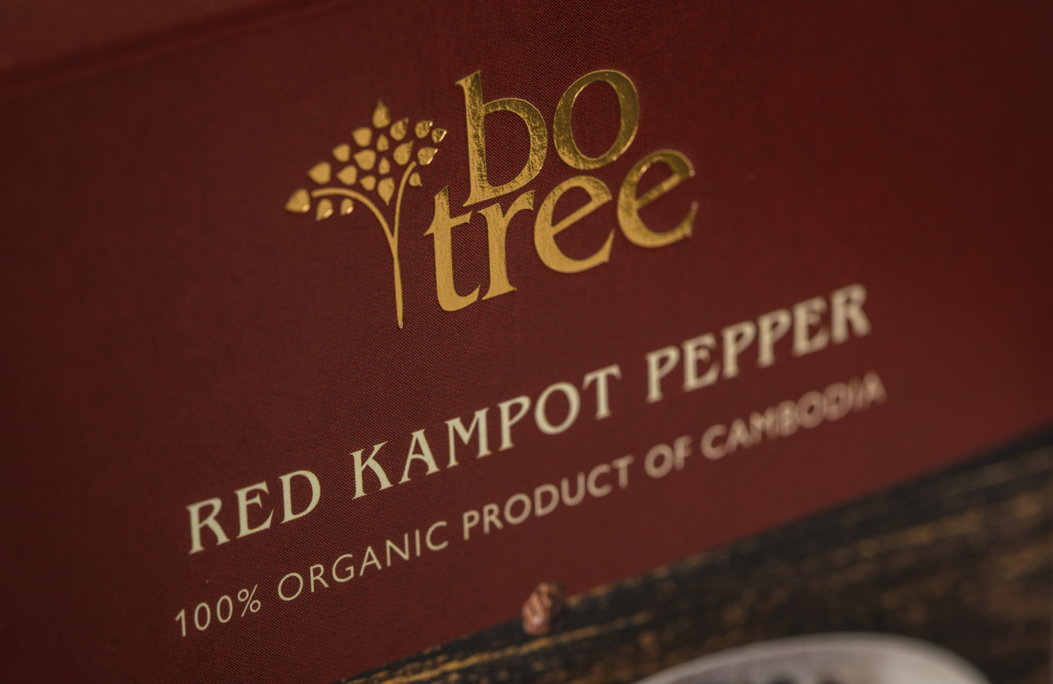
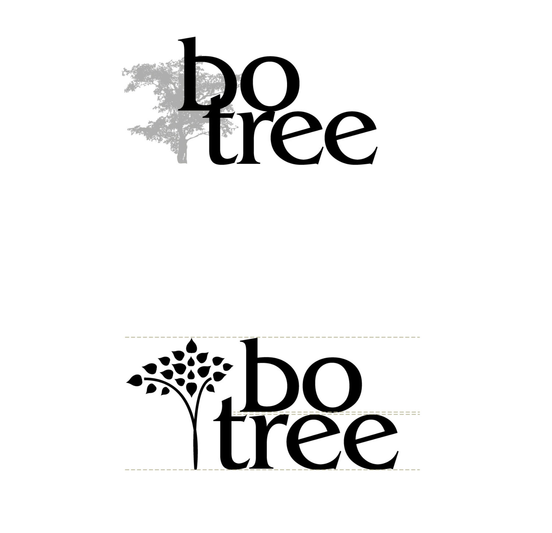
A new, stronger ‘tree’ mark combines leaves of the bo tree with a stem of pepper berries. The bo tree, or sacred fig, gives its name to the firm’s farm in Kampot.
The brief didn’t originally include the logo but, after beginning work on packaging, we all agreed a refresh was needed. The client was keen to retain the existing typeface; reworking the logotype meant it could be given some air.
Owner, BoTree Seasoning
Brand repositioning
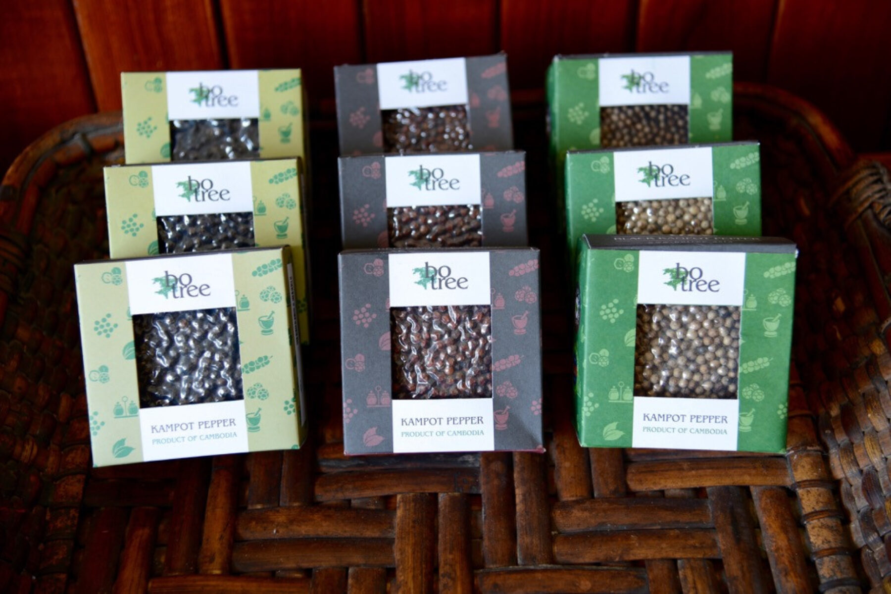
The existing BoTree packaging just wasn’t suitable for a luxury food.
High-end retailers loved BoTree pepper and its story—but knew
it wouldn’t sell in its original packs. Inadequate labelling was also creating customer
confusion about the different types of pepper.
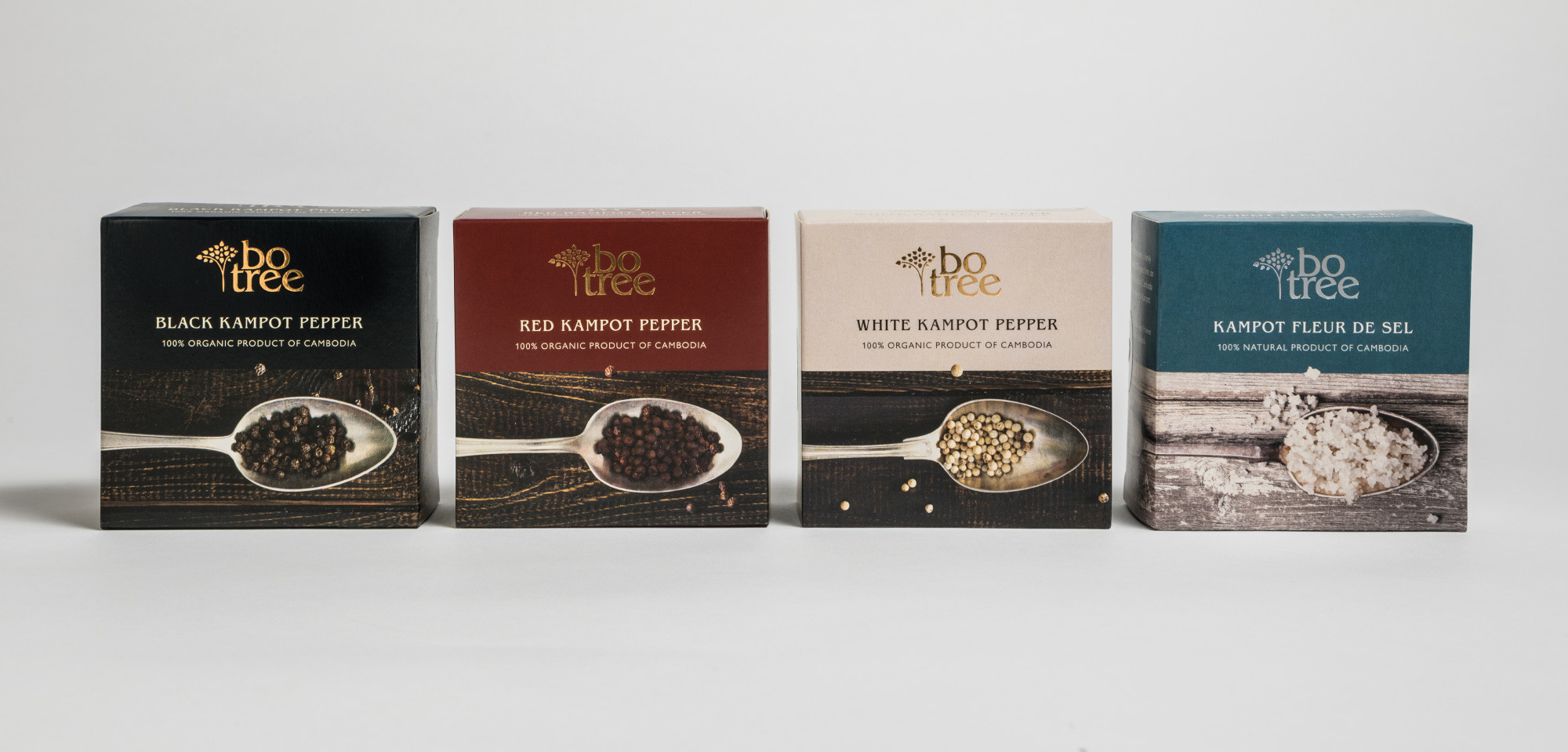
Packaging fit for purpose
Good packaging doesn’t need to be elaborate or overly expensive.
The redesigned pepper packs completely repositioned the BoTree brand—sales into the premium retail market quickly followed.
The packaging had become the brand’s key asset.
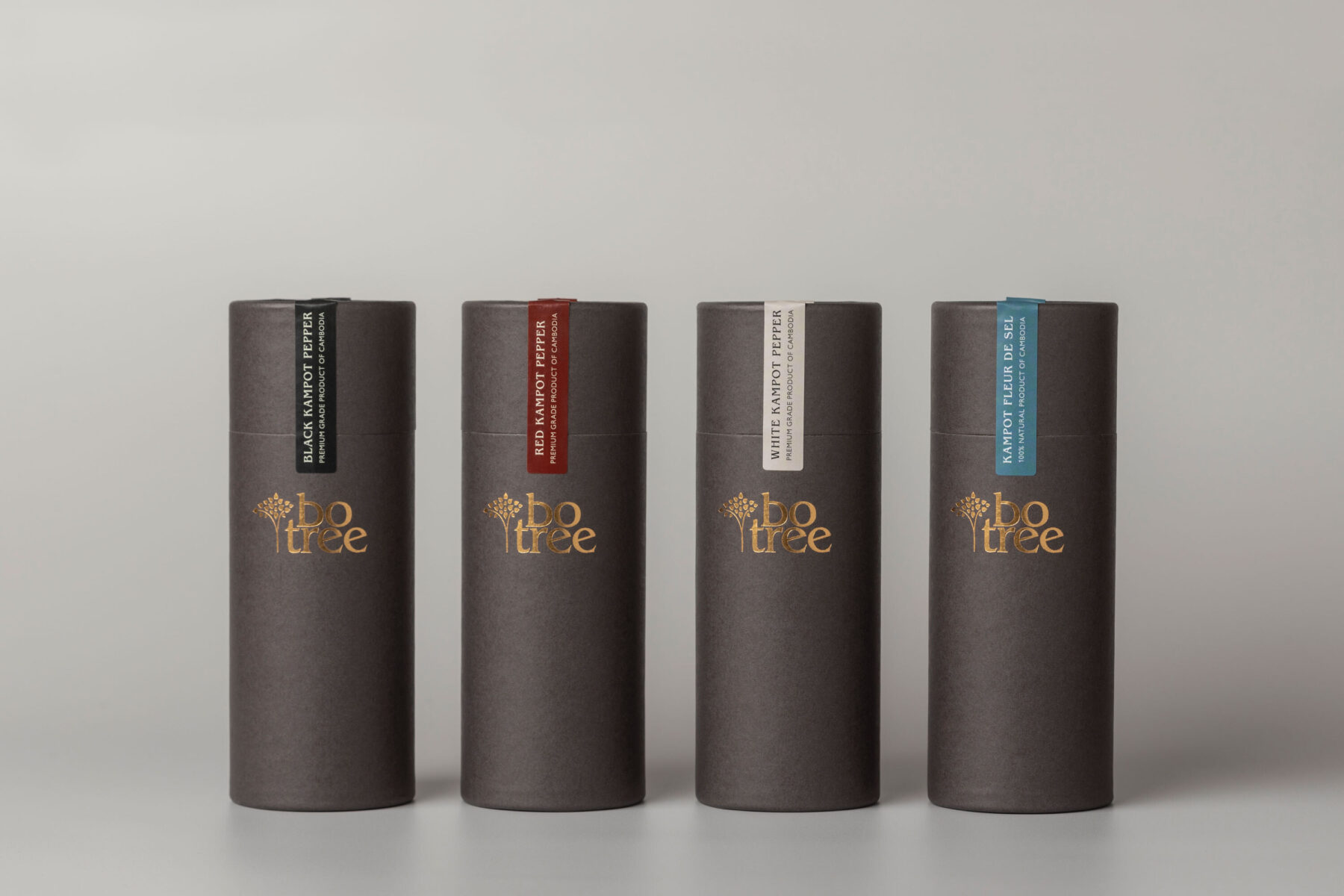
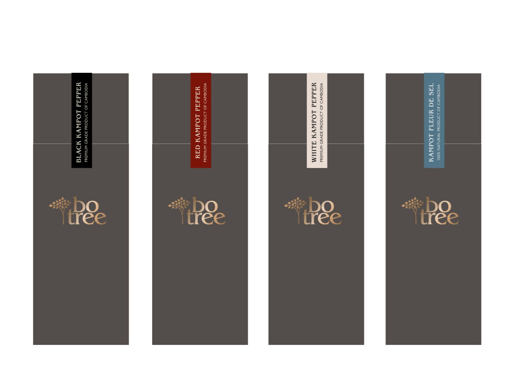
Confident, practical packaging
An elegant, second range of packaging marries form to function—with practical benefits.
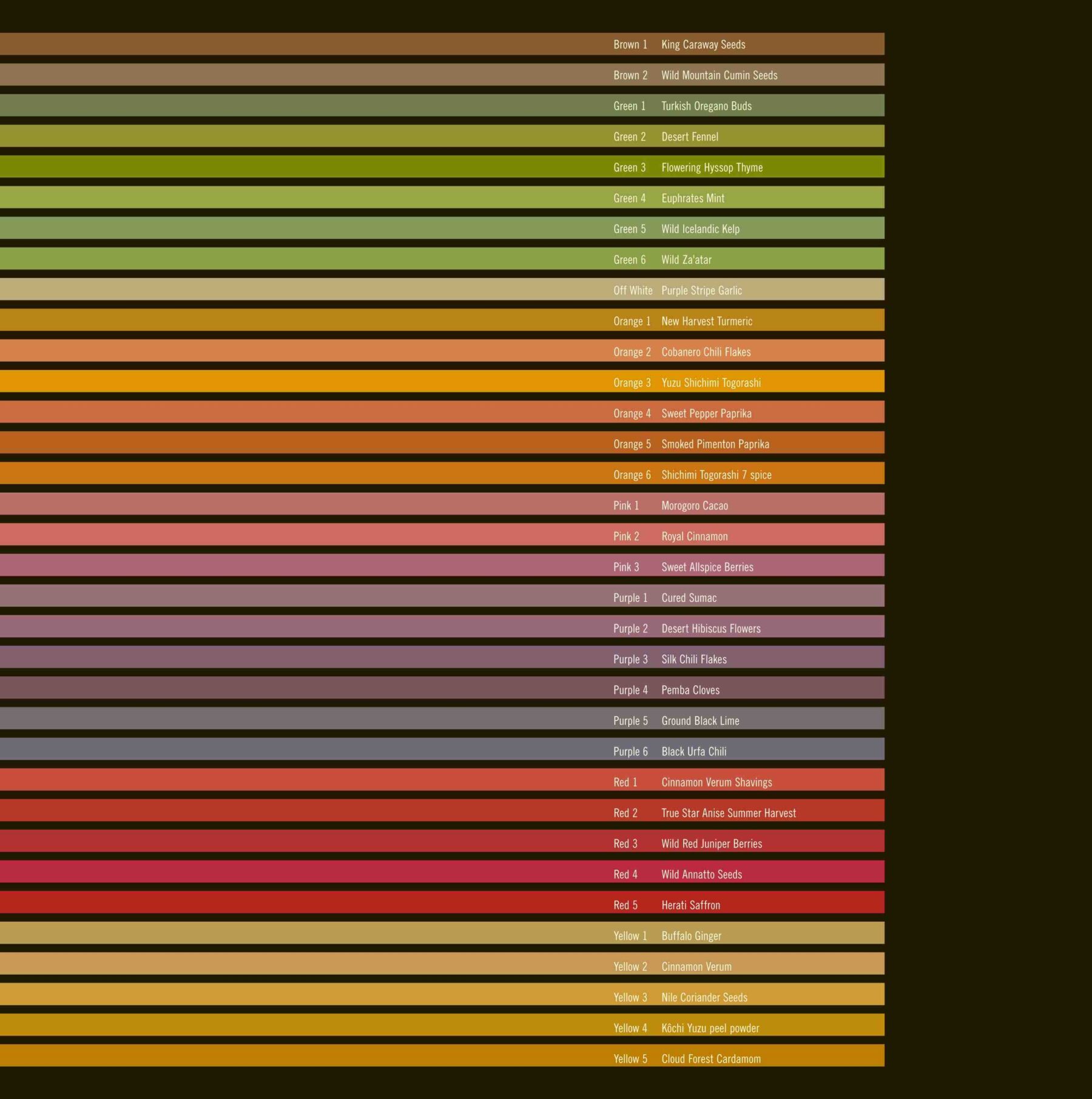
The understated, generic tubes can be made in bulk. Individual, tamper-proof labels are easily designed and printed. Minimal investment (and storage) is therefore required for new products.
Intended only for use at fairs, the pepper tubes have become so popular that they are now sold widely.
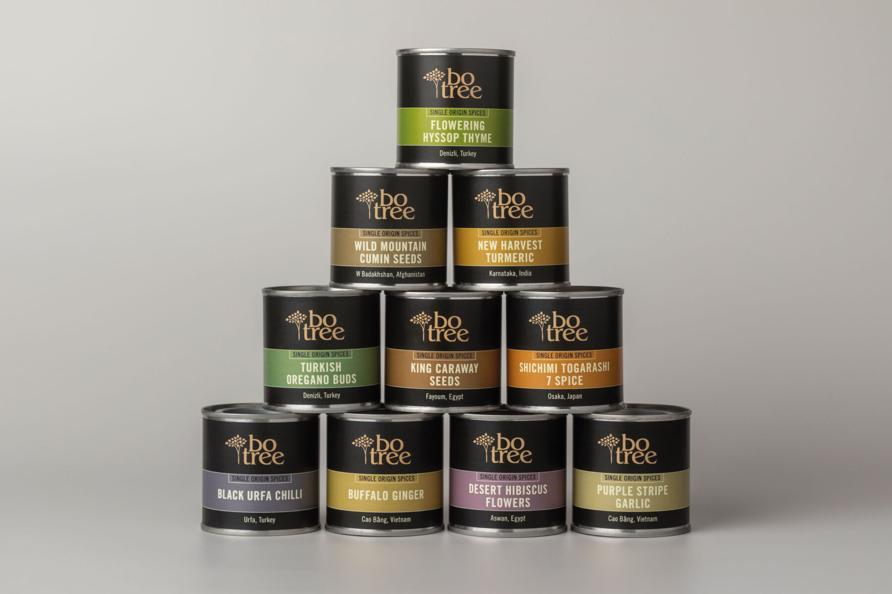
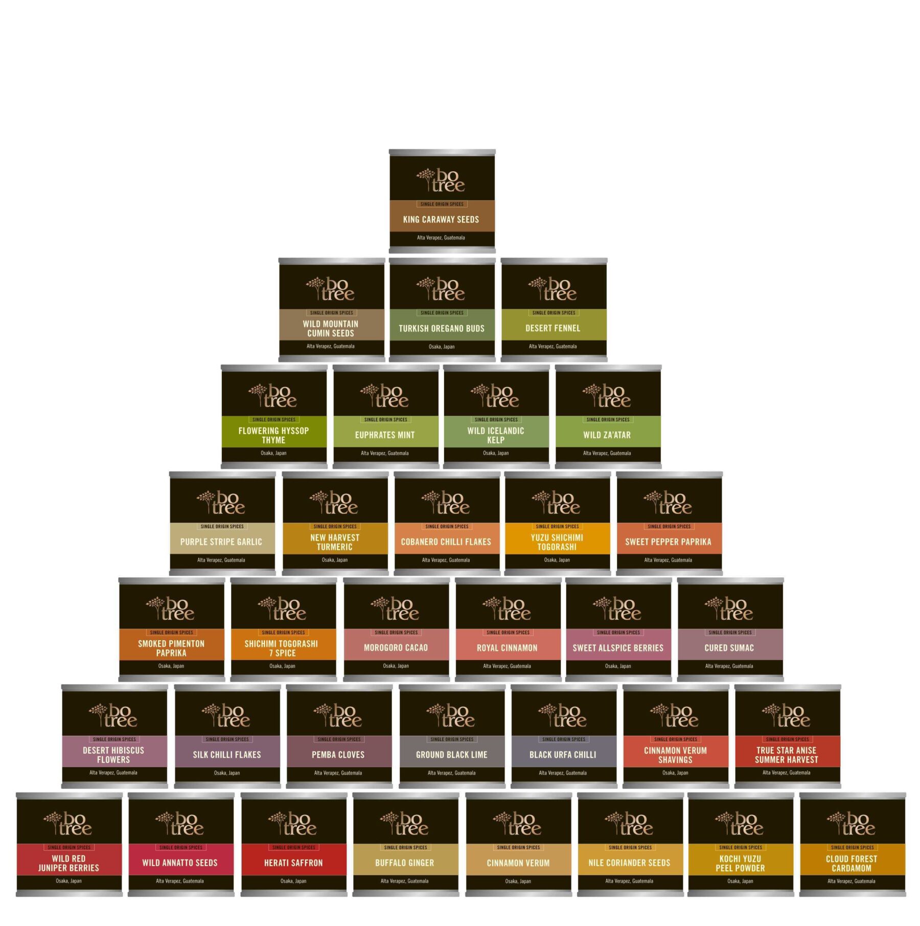
A seasoned brand expands
The now established visual language of BoTree extends into a new range.
In addition to its own pepper and salt, BoTree now sells thirty-four single estate and ethically sourced spices. Simplicity and use of colour make these sustainable and collectible: a visual and culinary treat.
Making a difference with design
BoTree’s growing success in international markets has supported the community farming its pepper.
During the Covid-19 pandemic, support of the community in Kampot has become acutely important. Tourism ground to a halt, but sales of BoTree seasonings held up well.
It is of no surprise that many discerning retailers now stock BoTree products—these are some of the best products Gail has ever worked with.
And it is a source of great pride that packaging design has contributed to the sustainability of the BoTree community.