A. Michael Collins
An adman becomes a storyteller on his own terms
Michael Collins has worked for some of the world’s top ad agencies. Now living in Canada, the Scot is carving out a career as a writer.
We helped Michael to build a profile for himself and for his stories, and delighted in the chance to make typography the leading character.
Being careful with cash
We often spend time shaping the brief in order to give our client best value for money.
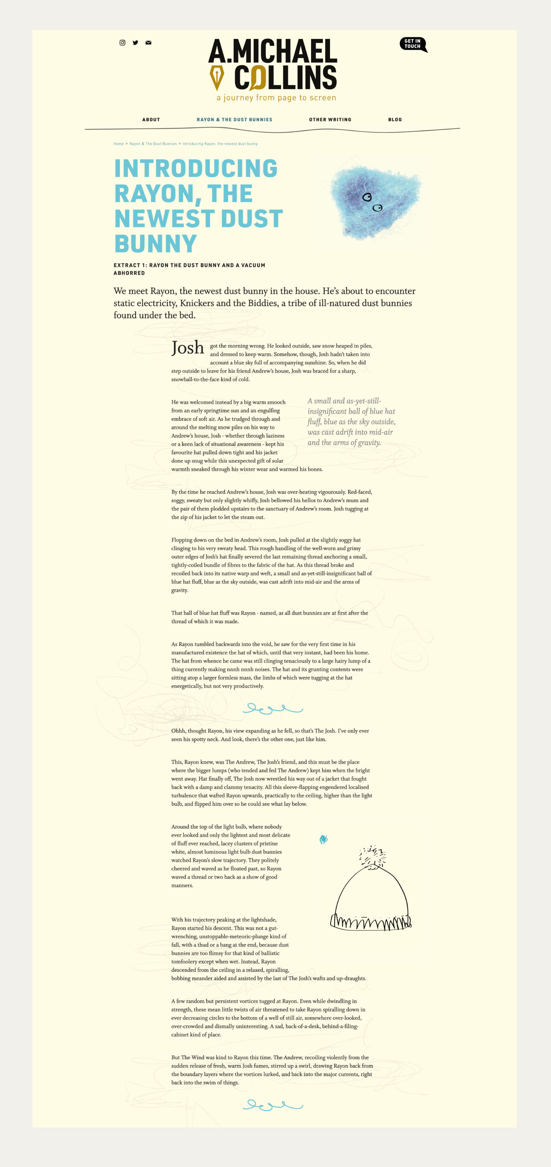
Originally, Michael wanted a website solely for his story about dust bunnies. He planned to document the whole process—agent rejections and all.
But the thing about writers is…they write.
We advised Michael that he needed a more flexible online home, for more than just one story, where he could build his profile.
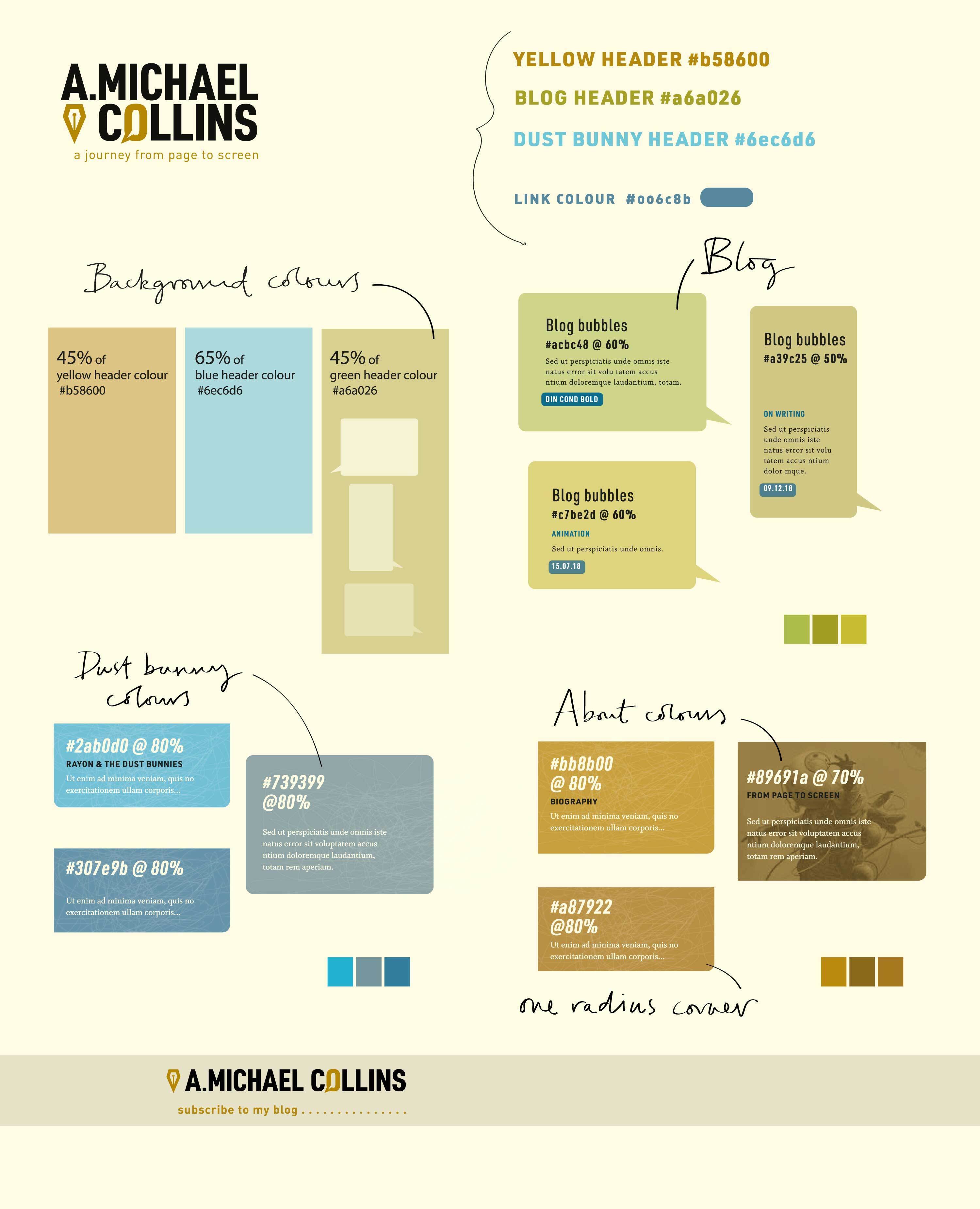
Look and feel for an author’s website
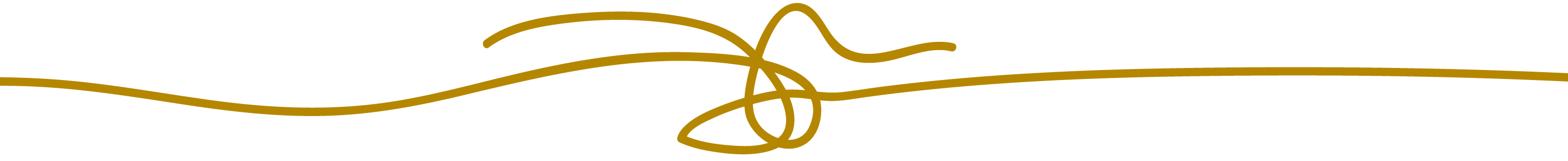
Michael had very little in the way of imagery. This gave us the opportunity to take a bold and typographic design route.
Detailing is extended further via use of colour and graphic layout
elements. The Dust Bunnies, Michael’s flagship piece, is treated as a special
case with its own colour scheme.
Visit amichaelcollins.com
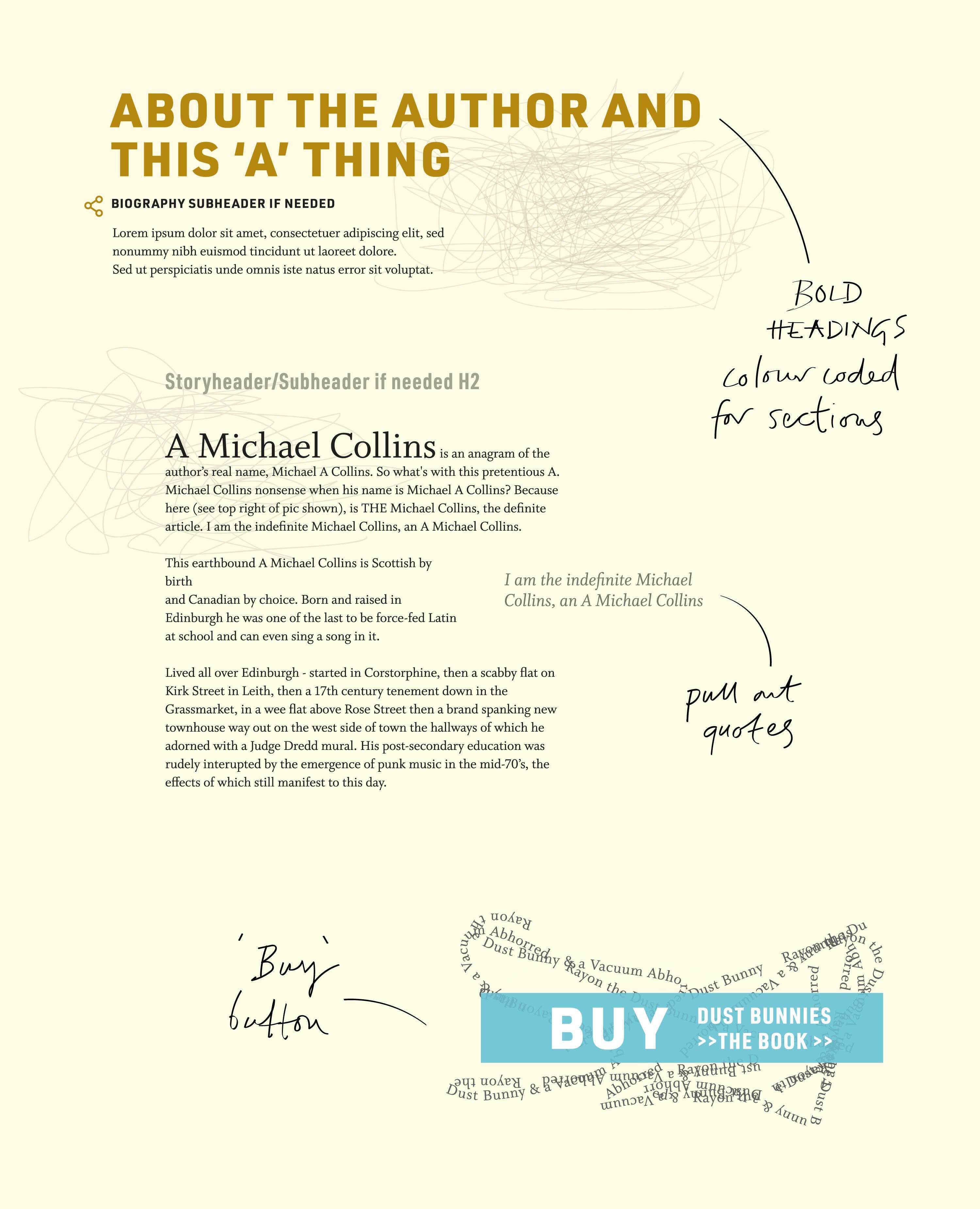
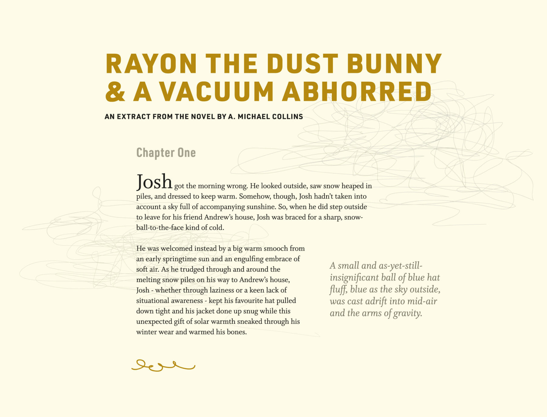
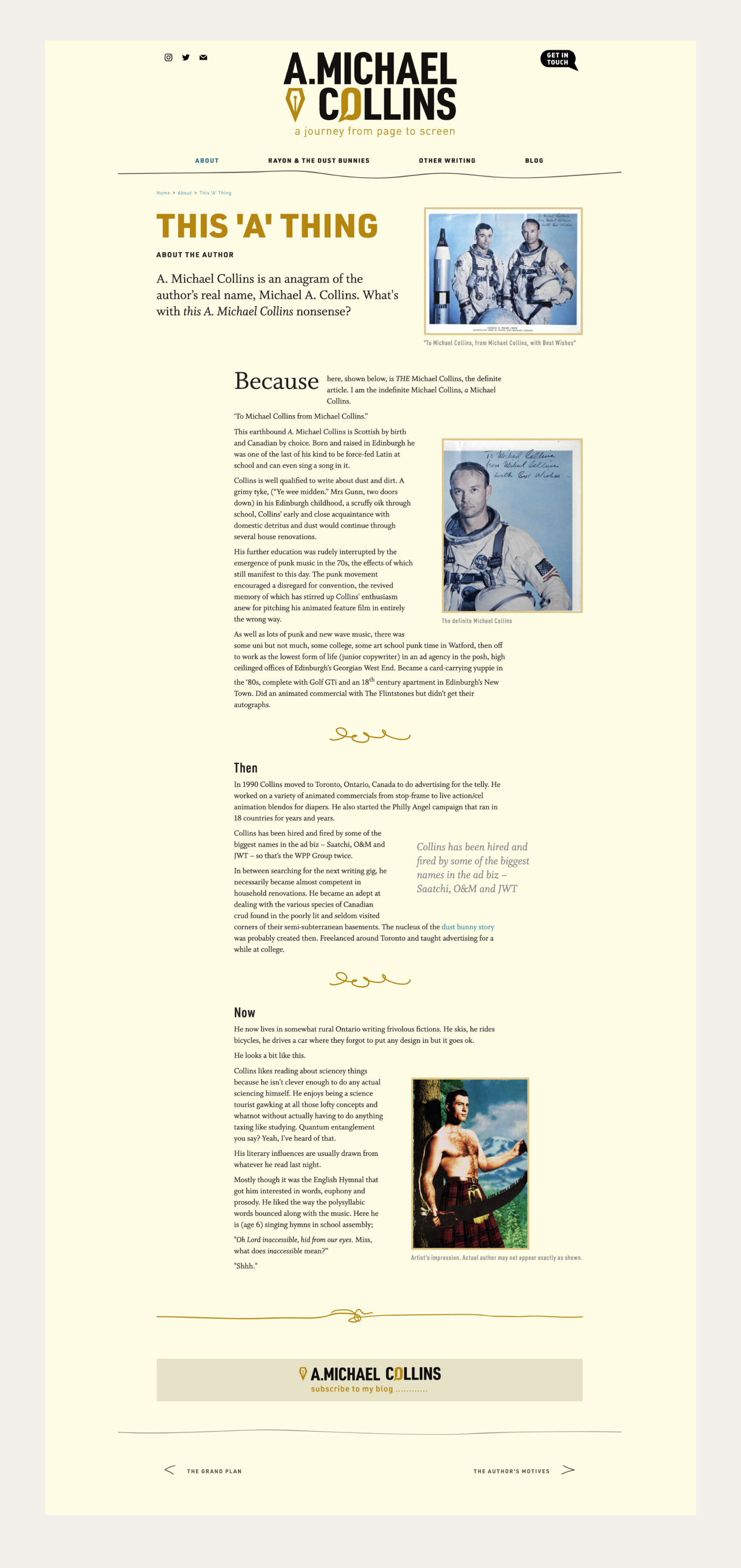
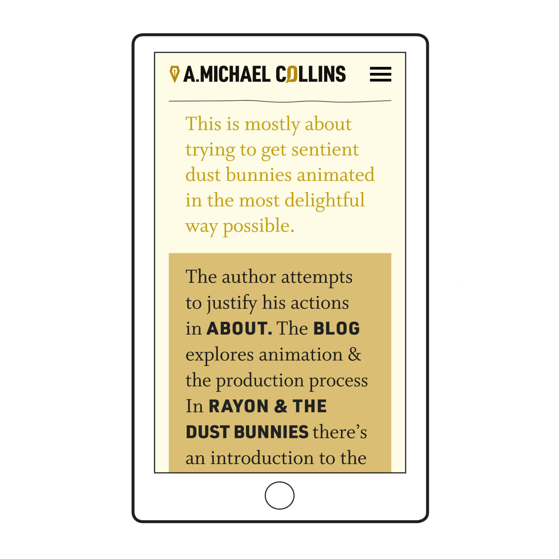
Layouts for long-form copy
Headers, standfirsts, pull-quotes, custom ornaments.
Bespoke, newspaper-inspired templates and varied typography make long reads digestible—both on desktop and in the responsive version of the site for mobile.
The images that Michael does use can be disparate in style and type, so we took care to embed them within the design.
CONTENT STRATEGY
We also advised on editorial and content strategy, content design and content planning.
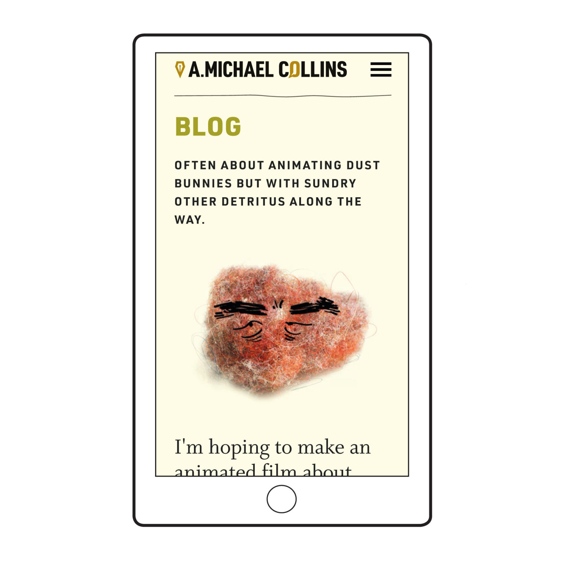
What is a dust Bunny anyway?
Michael is a writer: he is not an illustrator or animator.
But he is used to writing for the screen and hopes to see his story Rayon the Dust Bunny and a Vacuum Abhorred made into an animation.
We felt strongly that the dust bunnies’ appearance should be left open. Someone else will establish how the characters look.
However, it seemed important to show what a dust bunny actually is! Using Michael’s photographs we created some simple, animated illustrations.
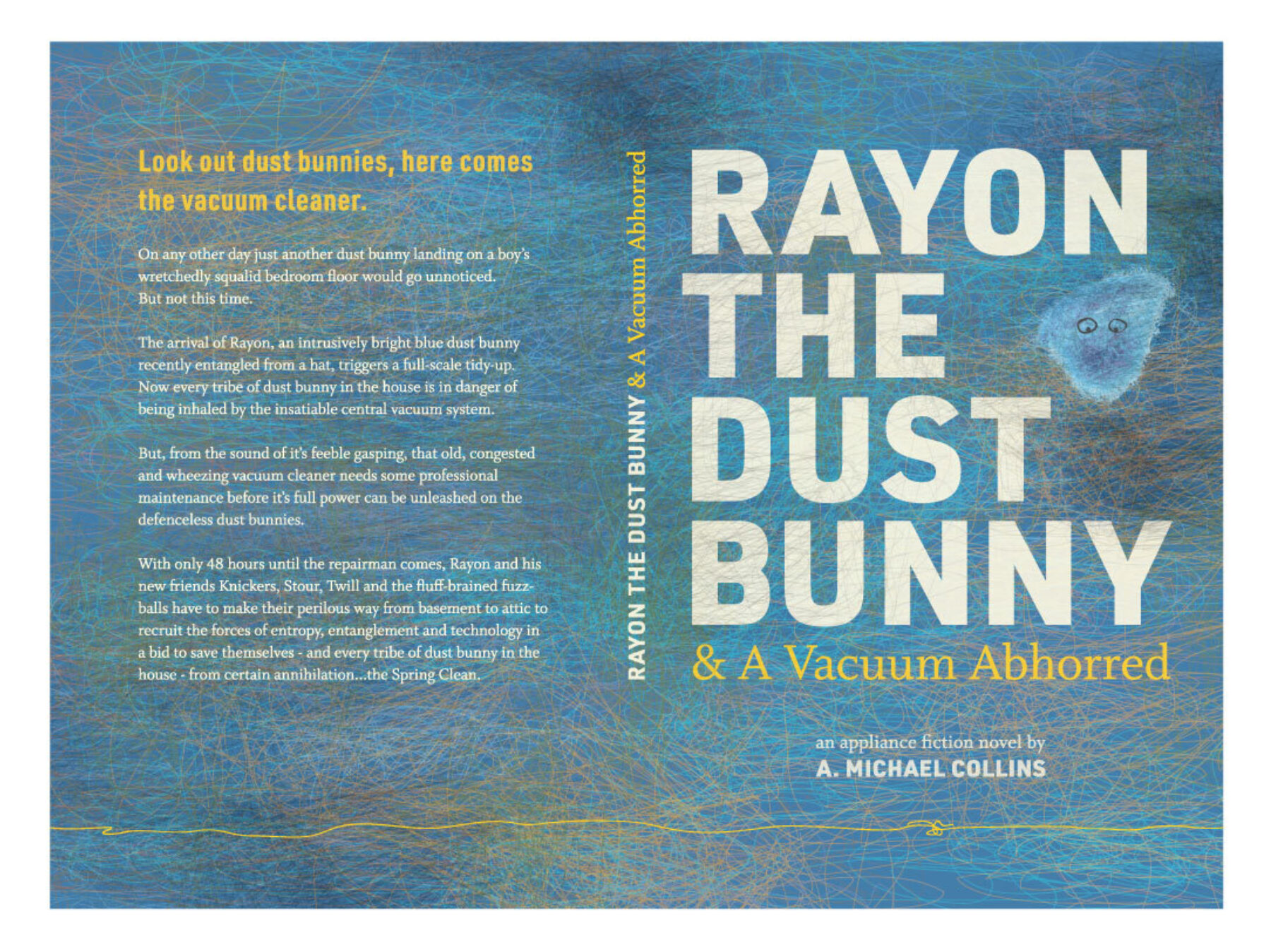
This is as far as visual character development is taken on the site. Typography remains the main stylistic element.
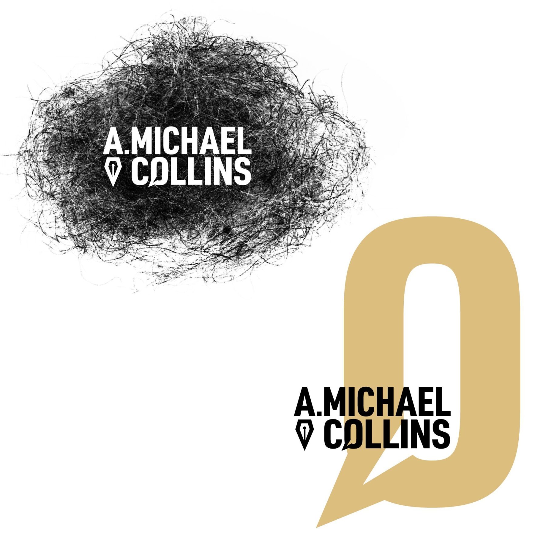
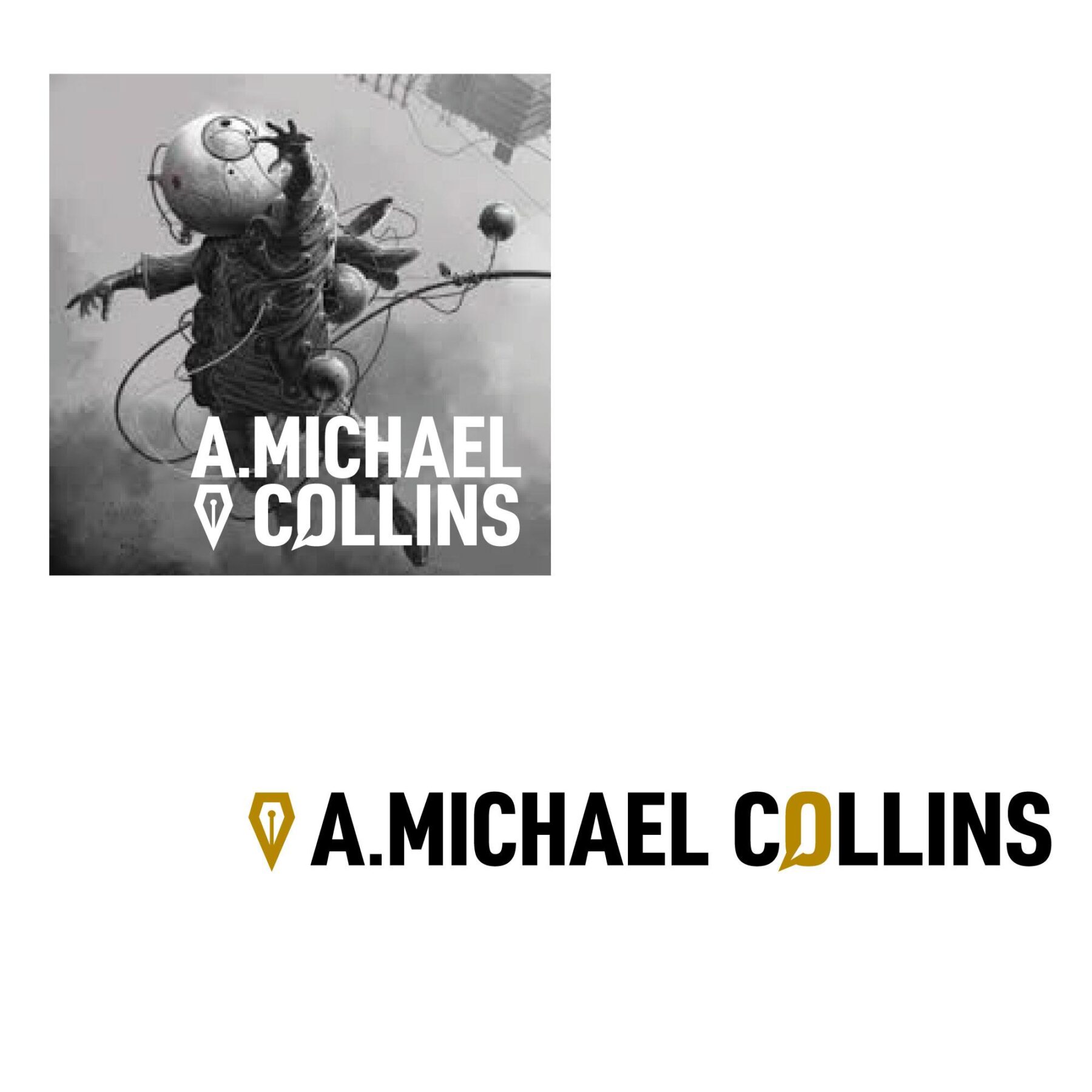
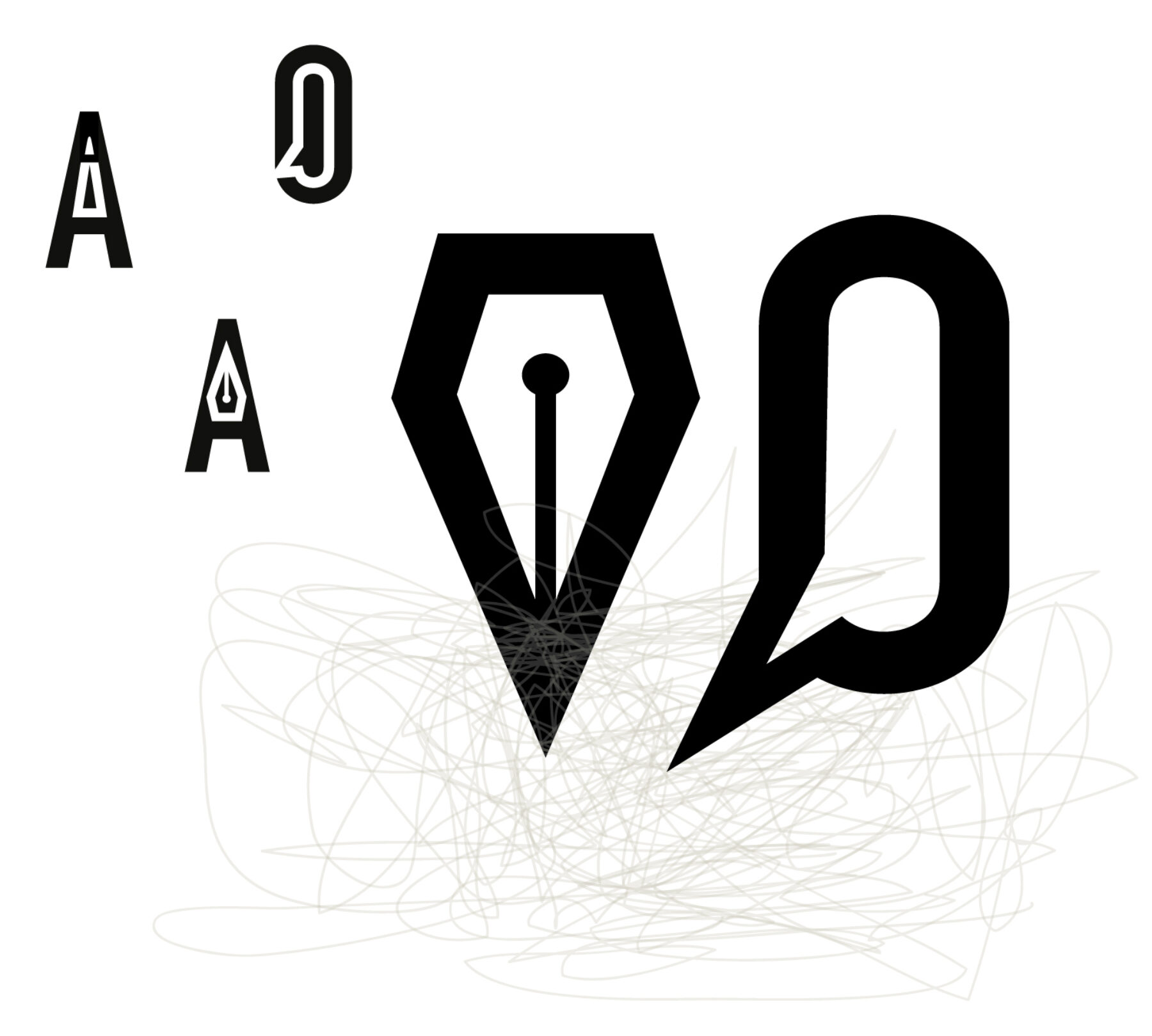
Logo becomes masthead
Any logotype needed to hold its own within a website that is heavy on typographic detail.
The final logo is strong enough to be reversed out. It can be stacked, or not: both versions are used on the website.
Marks contained within the logo can be pulled out and used where small icons are needed, including on social media.
Future proofing for creativity
Michael tested the flexibility of his website almost as soon as it had launched.
He is now exploring an untold narrative from his own family history. With a confident online presence, he is also making new connections and exploring possibilities for his work.
It has been such a creative pleasure to work on this project. We can’t predict what Michael might write next, but we feel sure that his website will be able to accommodate it.
Team