Cindy’s Tea
A revolution in a tea cup
A full rebrand took Cindy Ledgerwood’s tea business from a market stall to stockists and nationwide distribution.
Using Gail’s extensive knowledge of the food and drink sector, we designed premium but cost-effective packaging.
Brand direction
This brand needed to say tastes delicious, not just good for you.
Although Cindy’s credentials as a medical herbalist might have suggested a nutraceutical route, there were just too many other visual cues to ignore.
An updated apothecary look began to brew.
Friendly, but not cutesy.
Artisanal, not homemade.
Botanical,
not herbal.
A daily luxury that also makes a lovely gift.
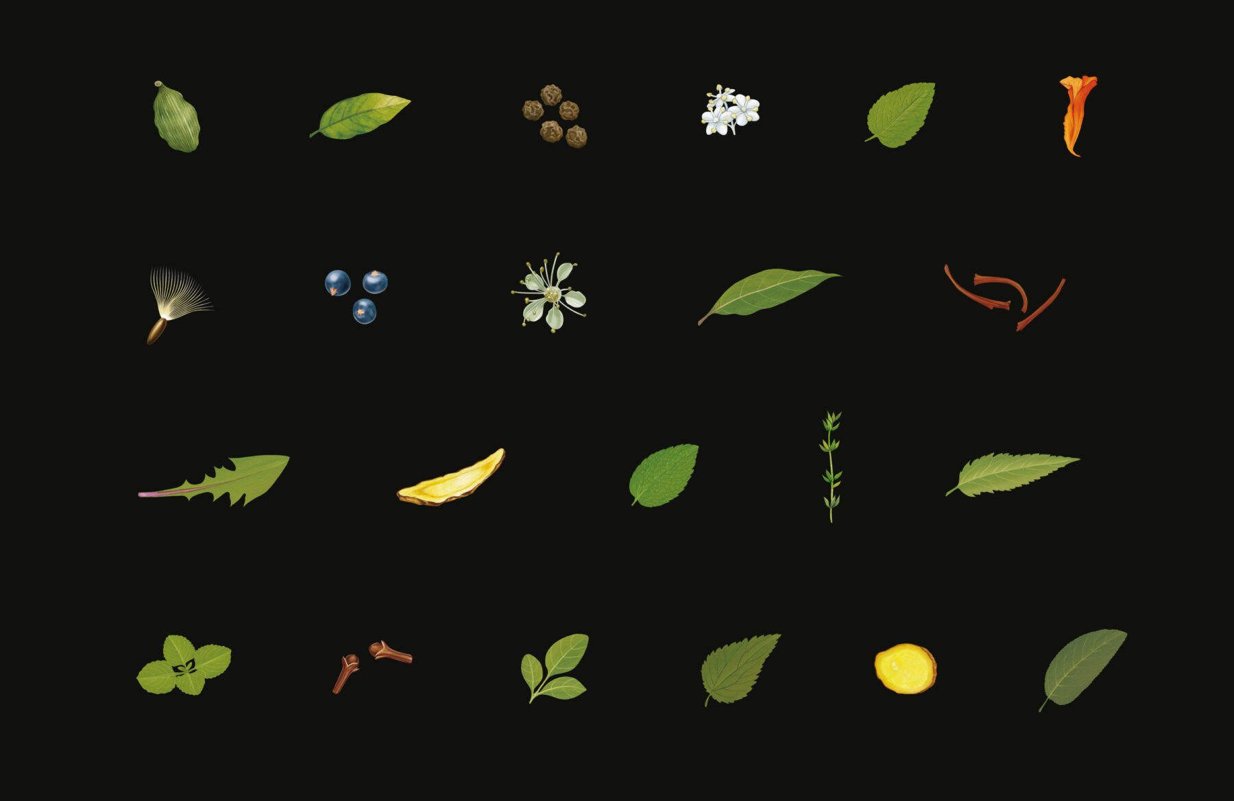
We commissioned Antony Miller to make a collection of botanical illustrations, to show the tea ingredients.
An informative and decorative addition to the packaging and website, these also relate to the large, loose leaves of the teas themselves.
Packaging design
Thinking around the brief can save money.
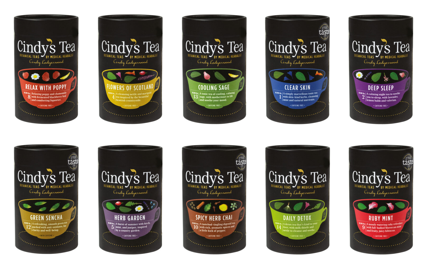
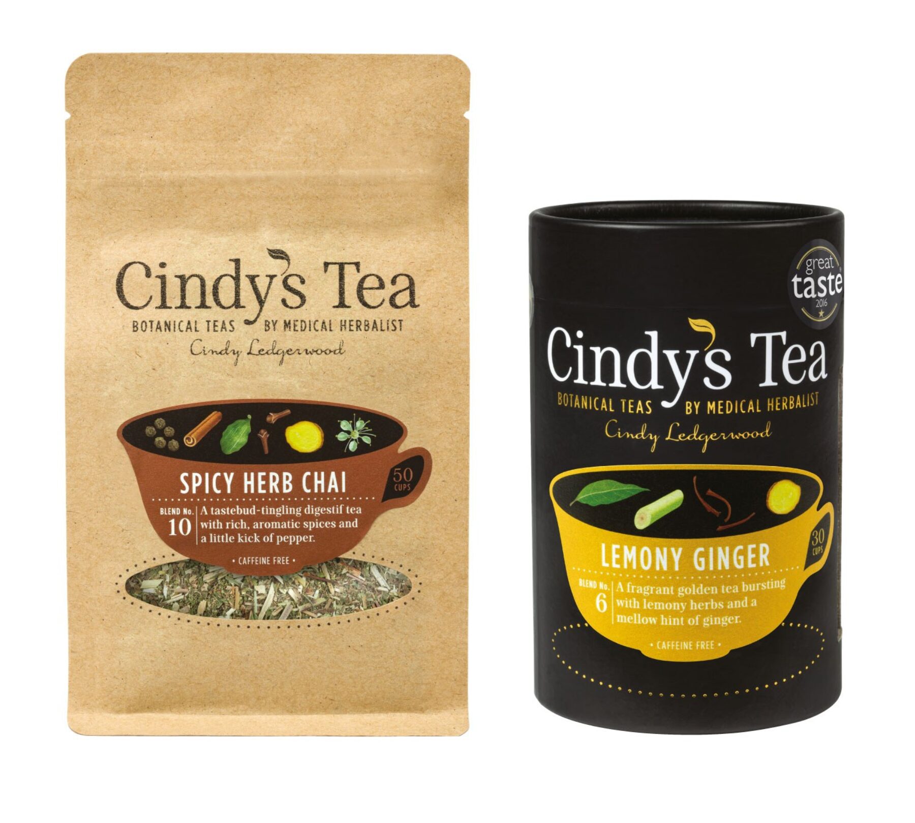
Using a system of printed packs with stickers, Cindy needs just two new stickers to launch a new blend.
It’s not obvious that the individual information is printed on stickers, which are designed to fit all pack sizes.
Packaging as a brand asset
Cindy’s Tea is a microbusiness with no budget for traditional advertising. These packs are really pieces of packvertising, which are designed to leap off the shelf when alongside similar food and drink products.
Logo design in context
The logotype is designed for good legibility on the shelf.
The serif typeface used (Patchouli—how appropriate!) has a relatively tall x-height. It marries well with other sans and serif typefaces used in print and digital contexts.
The leaf-apostrophe is foil blocked and is also used as a motif on tamper-proof stickers.
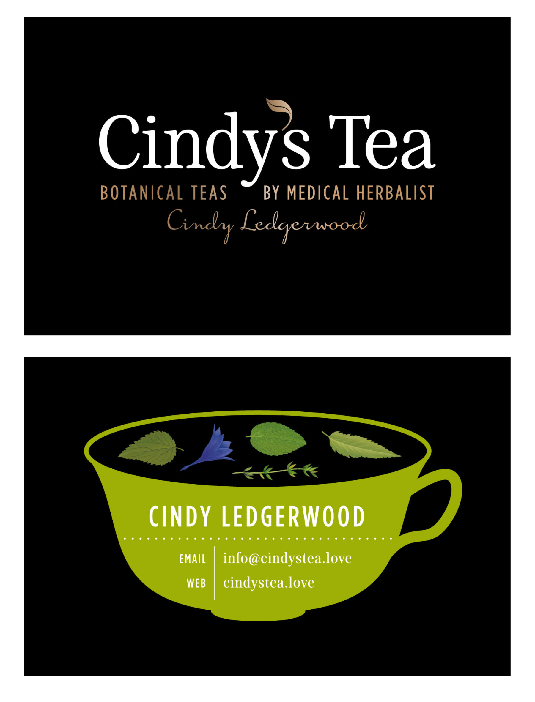
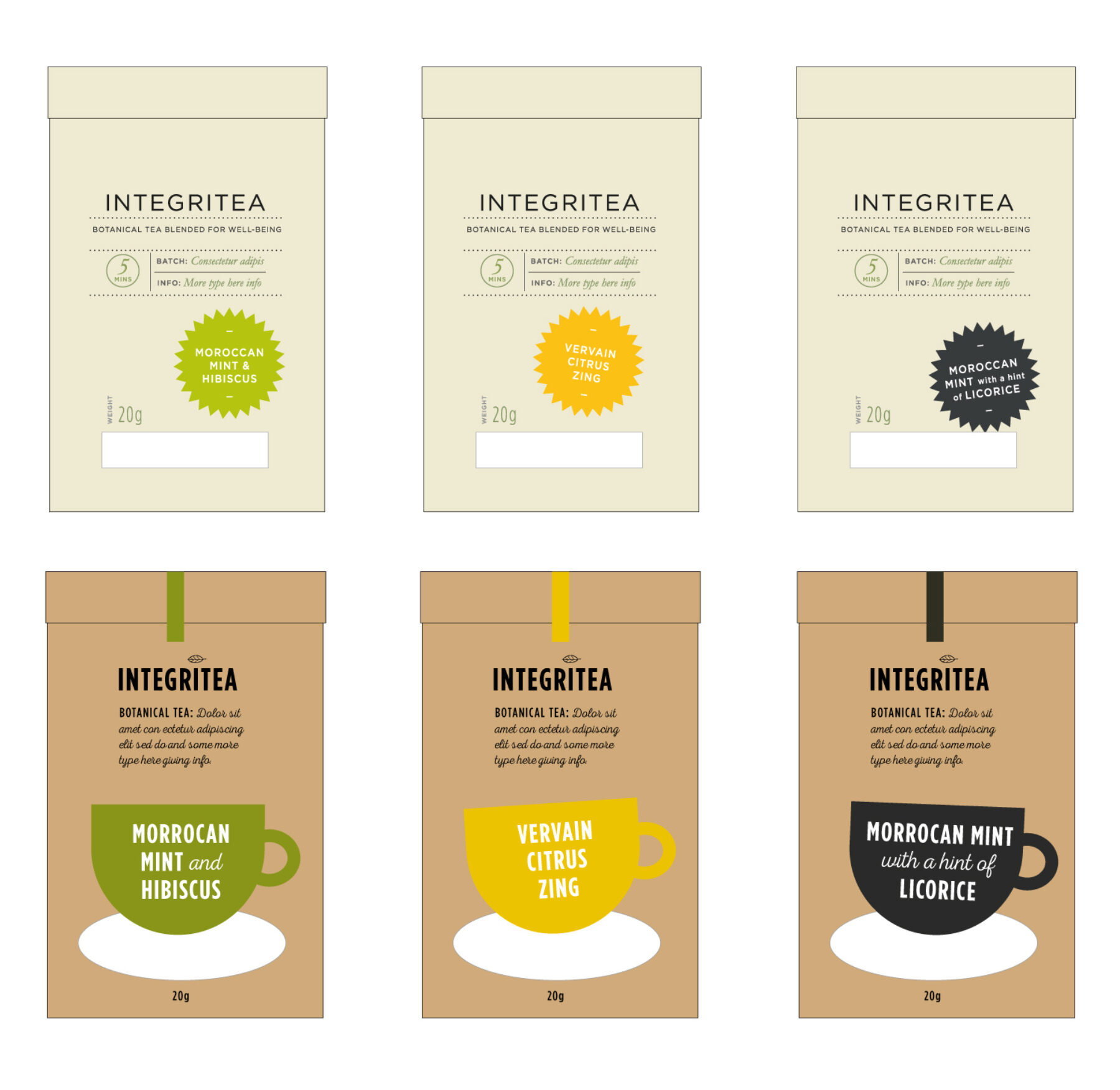
Brand name
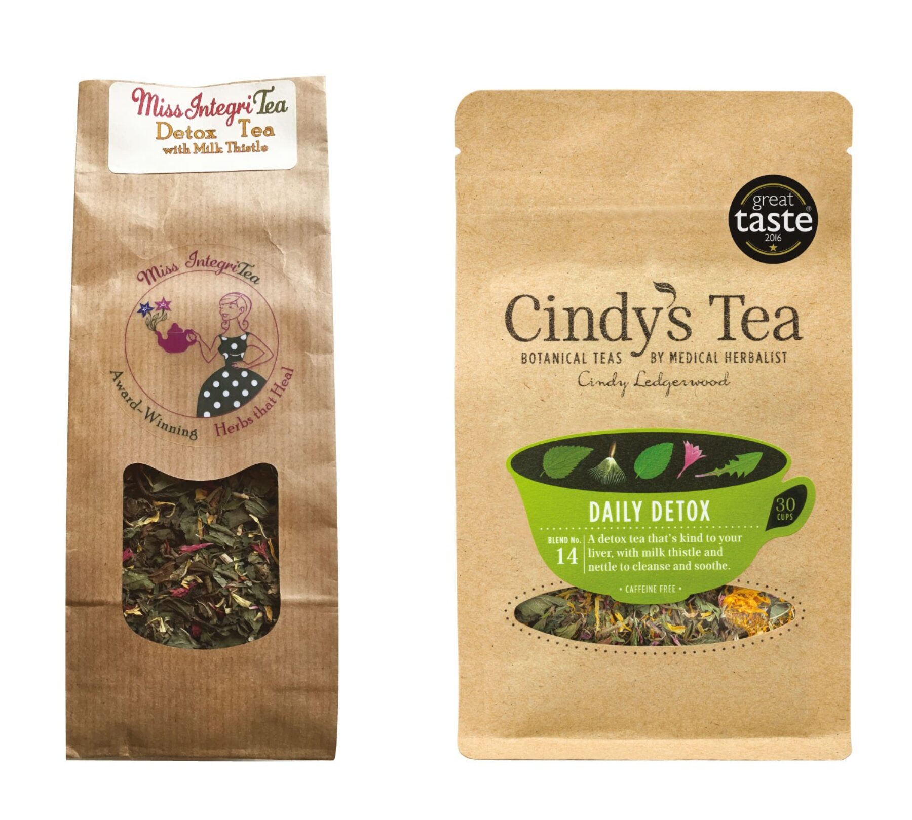
Cindy had been selling her tea for a couple of years under the name Miss Integritea.
As we worked through ideas for packaging, we all agreed that the name wasn’t working.
The loose-leaf blends are particular to Cindy who, being a medical herbalist, is so knowledgeable about plants and their uses. Therefore, tying the brand to its tea-blender-in-chief was a logical step.
We settled on the new name: Cindy’s Tea.
Digital design for brand coheREnce
With a look and feel now well established for the brand, we designed a clean and professional e-commerce website.
Cindy had a small budget for photography (we supervised a minimal shoot—it’s important to see what the tea looks like), but further detailing and interest come from bold typography.
The website and packaging are tightly cohesive.
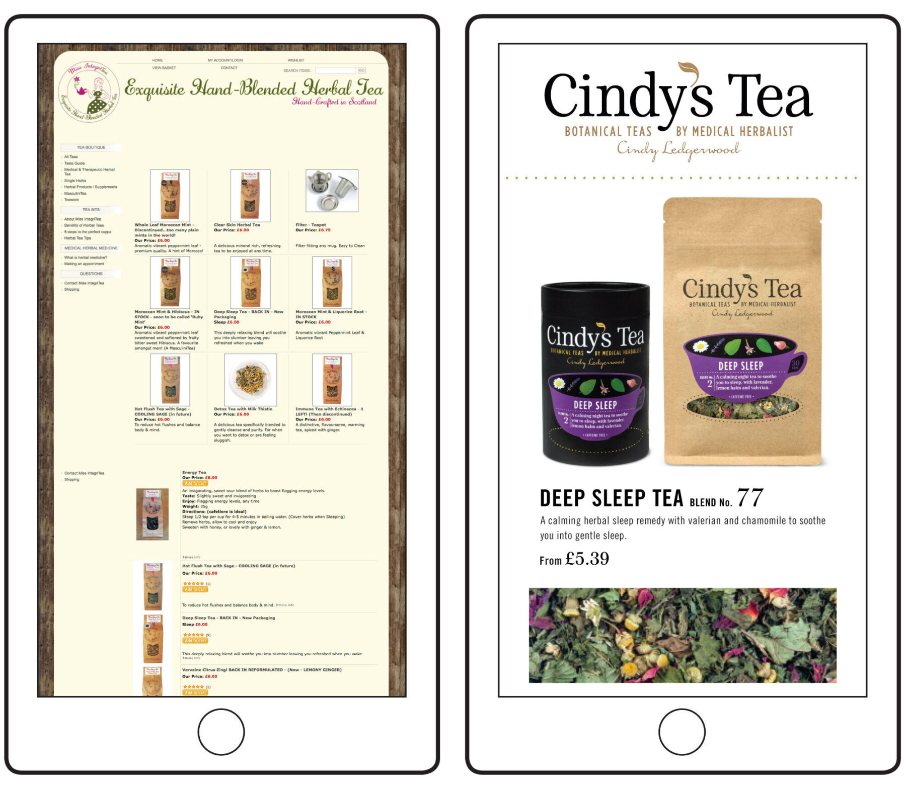
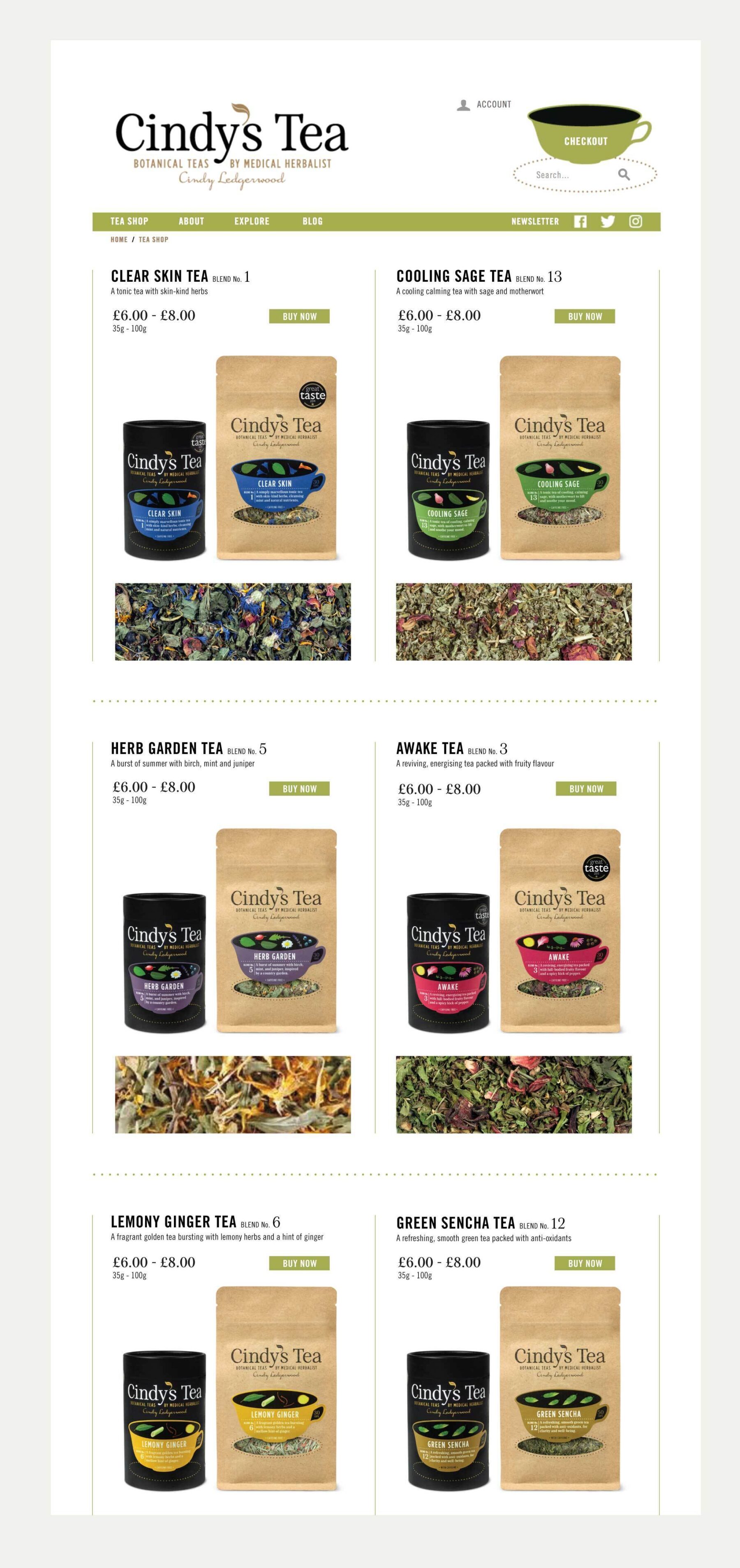
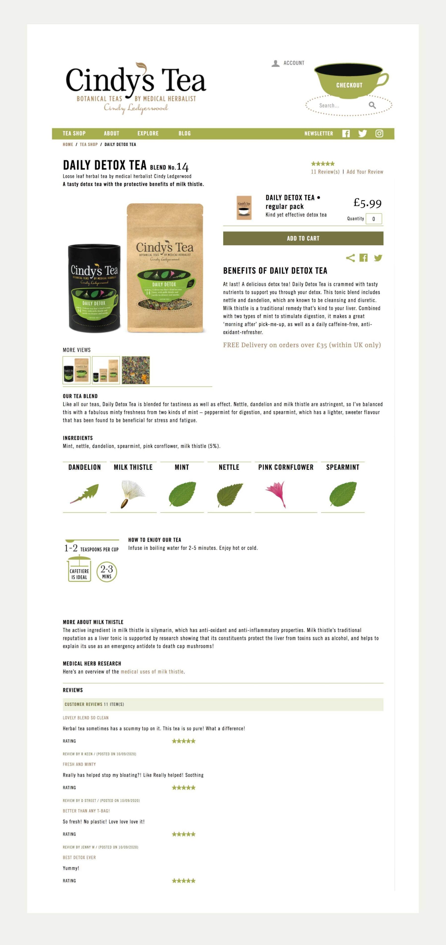
On the website, we took care to give space to the ingredients and benefits of the teas—more than might be expected for a business on this scale—to reinforce Cindy’s knowledge and expertise.
The impact of branding
A new website and smart packaging meant Cindy’s Tea was immediately taken more seriously by stockists and distributors.
And, when meeting retail customers herself, Cindy has a more grown-up platform from which to speak about her passion for plants and the role they can play in our well-being.